
Marketing layouts - special mobile-first responsive layout templates
Description
These special layout templates uses mobile-first approach and breaks
common stacking order on mobile devices (tablets, smart-phones
etc.),
which helps you to show your desired product on top
position while columns are stacked under each other.
Layouts have different stacking breakpoints which enables you
perfect targeting for your
user base to achieve great user
experience on every device (smartphone, table, PC etc.).
Breakpoints are 575 px, 767 px, 991 px and 1279 px.
The best way
to figure out which devices uses your users the most is to look for
these stats in
tools such as Google Analytics etc. and then use
layout with breakpoint which suits the majority of
your users to
achieve best user experience.
Layout sets has different thumbnail colors for quick recognition
at Liferay control panel
which enables you high productivity while
creating new pages.
Layouts HTML markup is developed according to Twitter Bootstrap 4
HTML/CSS framework rules, which is part
of Liferay 7.1, that means
that they are universal and could be used with any Liferay 7.1 theme.
Layouts (each layout with breakpoints 575 px, 767 px, 991 px and
1279 px):
2 Columns right first
1-2 Columns right first
1-2-1 Columns right first
2 Columns (66/33%) right first
1-2
Columns (66/33%) right first
1-2-1 Columns (66/33%) right
first
2 Columns (33/66%) right first
1-2 Columns (33/66%)
right first
1-2-1 Columns (33/66%) right first
3 Columns
center first
1-3 Columns center first
1-3-1 Columns center
first
4 Columns right first
1-4 Columns right first
1-4-1
Columns right first
After deployment to Liferay server instance, layouts are
available for all Liferay Sites/Themes.
To change layout of the page:
1.) login to Liferay Control
Panel
2.) under your Liferay Site click Build
3.) then click
to Pages
4.) on each page click on three dots and then click on
Configure
5.) select which layout you want to use and click Save
More in Experience Management

1-1-1 Columns Layout CE
Simple three row template with 100% of width. Usefull to use in conjuntion with page templates (Prototypes). This layout will appear in your Page Layouts once installed. Check or request for more temp

14 Additional Basic Layouts Pack
Get 14 additional basic layouts to complete your portal in no time! You get: 1-3-1 Basic columns 1-3-2 Basic columns 1-3 Basic columns 1-4-1 Basic columns 2-3-1 Basic columns 3-1 Basic columns 4-1 Bas

2 Columns (10-90) Page Layout
Layout Templates allow you to choose how portlets will be arranged on a page. They are simple table or CSS-based containers into which portlets can be dropped and sit within the body of the page. Life
2 Columns (20-80) Page Layout
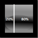
Layout Templates allow you to choose how portlets will be arranged on a page. They are simple table or CSS-based containers into which portlets can be dropped and sit within the body of the page. Life
More by Lukas Grygar

37 responsive layout templates for Liferay 6.2
37 responsive layout templates for Liferay 6.2 CE (6.2.0+) and Liferay 6.2 EE (6.2.10+). 1-2 Columns 1-3 Columns 1-3-1 Columns 1-3-2 Columns 1-4 Columns 1-4-1 Columns 1-4-4 Columns 12 Columns 2 Column

40+ responsive layout templates for Liferay 7
Septem layout templates is pack of 40+ responsive layout templates for Liferay 7. 119 templates in total. Exactly 41 responsive layout templates and each layout template rows could be stacked differen

Anchita Theme - responsive multi-purpose corporate business theme
Features: Custom colors configurable through theme setting by color picker Color schemes Full width responsive image carousel Responsive design Cross-browser compatible Lot of templates and structures

Bootstrap 3 for Liferay 6.2 - Tribus Theme
This theme is bringing you HTML/CSS framework Bootstrap 3 to Liferay 6.2 theme, which is not an easy task as you may already know. Integrating Bootstrap 3 with Liferay 6.2 is not an easy task if you w