
Bootstrap 3 for Liferay 6.2 - Tribus Theme
Description
Integrating Bootstrap 3 with Liferay 6.2 is not an easy task if you want to use Liferay's dockbar, due to fact that Liferay 6.2 (AUI) uses Bootstrap 2. So I've tried to do my best and put a lot of know-how to this theme to bring you Bootsrap 3 theme for Liferay 6.2
There's small disadvantages, such as the left panel is not sliding from left side but it slides above the dockbar. But still it's a small fee for having Bootstrap 3 on Liferay 6.2 because Bootstrap 3 is awesome.
This theme also contains 16 color schemes, so with default Bootstrap 3 look it gives you 17 different skins in total.
Features:
- responsive design
- cross browser compatibility
- Bootstrap 3 (version 3.3.6)
- Font Awesome (version 4.6.3) icons
- full width carousel
- parallax effect (web content and special layout template)
- 16 color schemes from bootswatch.com, together with default Bootstrap 3 theme it gives 17 different looks in total
- structures and templates (Carousel, About us, Services, Portfolio, FAQ, Featurette, Info paragraph 2 columns, 3 columns, 4 columns)
- custom theme layouts which works with Bootstrap 3 included in theme
- second level navigation
- navbar dropdowns compatible with adaptive devices
- breadcrumbs
- various theme settings
- full width Bootstrap 3 container (container-fluid) could be enabled/disabled through Theme Setting
- default or inverse color of Bootstrap 3 navbar configurable through Theme Setting
- Bootstrap 3 JavaScript tooltips (could be enabled/disabled through Theme Setting)
- Bootstrap 3 JavaScript popovers (could be enabled/disabled through Theme Setting)
- full width container (Bootstrap's container-fluid) configurable through theme setting
- order of The Title and Company Name in page title could be switched through Theme Setting for better SEO
- all images (img elements) on site could be grayscaled (configurable through theme setting)
- Google Fonts runs through https://
- back to top button scrolls slowly to the top of the page
Prerequisites:
- Resources Importer
- Marketplace Portlet
Recommendations:
- if it's checked then uncheck "Show Portlet Borders by Default" Theme Setting in Control Panel
More in Experience Management

1-1-1 Columns Layout CE
Simple three row template with 100% of width. Usefull to use in conjuntion with page templates (Prototypes). This layout will appear in your Page Layouts once installed. Check or request for more temp

14 Additional Basic Layouts Pack
Get 14 additional basic layouts to complete your portal in no time! You get: 1-3-1 Basic columns 1-3-2 Basic columns 1-3 Basic columns 1-4-1 Basic columns 2-3-1 Basic columns 3-1 Basic columns 4-1 Bas

2 Columns (10-90) Page Layout
Layout Templates allow you to choose how portlets will be arranged on a page. They are simple table or CSS-based containers into which portlets can be dropped and sit within the body of the page. Life
2 Columns (20-80) Page Layout
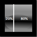
Layout Templates allow you to choose how portlets will be arranged on a page. They are simple table or CSS-based containers into which portlets can be dropped and sit within the body of the page. Life
More by Lukas Grygar

37 responsive layout templates for Liferay 6.2
37 responsive layout templates for Liferay 6.2 CE (6.2.0+) and Liferay 6.2 EE (6.2.10+). 1-2 Columns 1-3 Columns 1-3-1 Columns 1-3-2 Columns 1-4 Columns 1-4-1 Columns 1-4-4 Columns 12 Columns 2 Column

40+ responsive layout templates for Liferay 7
Septem layout templates is pack of 40+ responsive layout templates for Liferay 7. 119 templates in total. Exactly 41 responsive layout templates and each layout template rows could be stacked differen

Anchita Theme - responsive multi-purpose corporate business theme
Features: Custom colors configurable through theme setting by color picker Color schemes Full width responsive image carousel Responsive design Cross-browser compatible Lot of templates and structures

Marketing layouts - special mobile-first responsive layout templates
These special layout templates uses mobile-first approach and breaks common stacking order on mobile devices (tablets, smart-phones etc.), which helps you to show your desired product on top position