
Accordion Set Fragment
Description
The Accordion Set fragment brings flexible, modern
accordion functionality to Liferay pages without relying on external
libraries. Built with native HTML <details>
elements, it’s fast, accessible, and easy to configure.
Key Features:
-
Pure HTML + CSS + JS — No external libraries required.
-
Configurable IDs — Each accordion gets a unique ID (
accordion{i}) based on your chosen Start Index. -
Adjustable Amount — Create as many accordions as you need using the Accordion Amount setting.
-
Optional State Persistence — Enable Get Local Storage to save open/closed states so they remain the same after a page refresh.
-
Responsive & Accessible — Works with native browser behavior while enhancing styling.
Configuration Options:
-
Start Index — Sets the starting value of
ifor accordion IDs. -
Accordion Amount — Number of accordions to generate in this set.
-
Get Local Storage — When enabled, the state of each accordion is stored in local storage and restored on reload.
Usage Notes:
-
IDs follow the pattern
accordion{i}, incrementing by 1 for each accordion in the set. -
Default behavior is for accordions to start open unless local storage state says otherwise.
More in Content Management & Operations

Accordeon
Animated Accordeon Fragment with configuration for showing 1-10 visible elements and toggling if multiple or only a single element can be expanded. The content area of each element is a dropzone in wh

AI Summarizer
This app provides AI-powered summarization capabilities to the Document Library. This application adds a "Summarize" button to a document's detail screen in the Document Library. With a sing

Animate.css
With this extension, you can add animation effects to any fragment simply by adding the appropriate Animate.css class (e.g. `animate__fadeIn`, `animate__bounce`) to the field Advanced → CSS → CSS Clas

Collection display grid view with Item Highlight
This fragment enhances a standard Collection Display by introducing a custom grid layout where one item can be highlighted with a larger visual style. It allows authors to choose which item to highlig
More by Liferay Community

Announcement Card
The Announcement Card fragment makes it easy to highlight news, events, or featured content in a visually engaging way. The card is fully customizable, allowing you to set your own image, date, header
Colorful Cards
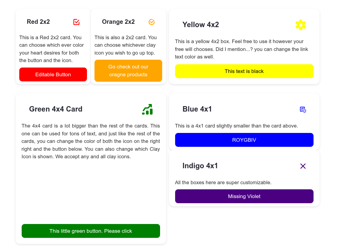
Fully customizable cards where you control every detail. Pick any Clay icon, set its color, and style the button with your own background and text colors. Choose from four flexible sizes — 4x4, 4x2, 4

Content And Media Library
A generic Content and Media Library built with Liferay Objects and Picklists to manage digital assets such as documents, images, and media files. It supports metadata (type, status, visibility), versi
Content Card Collection
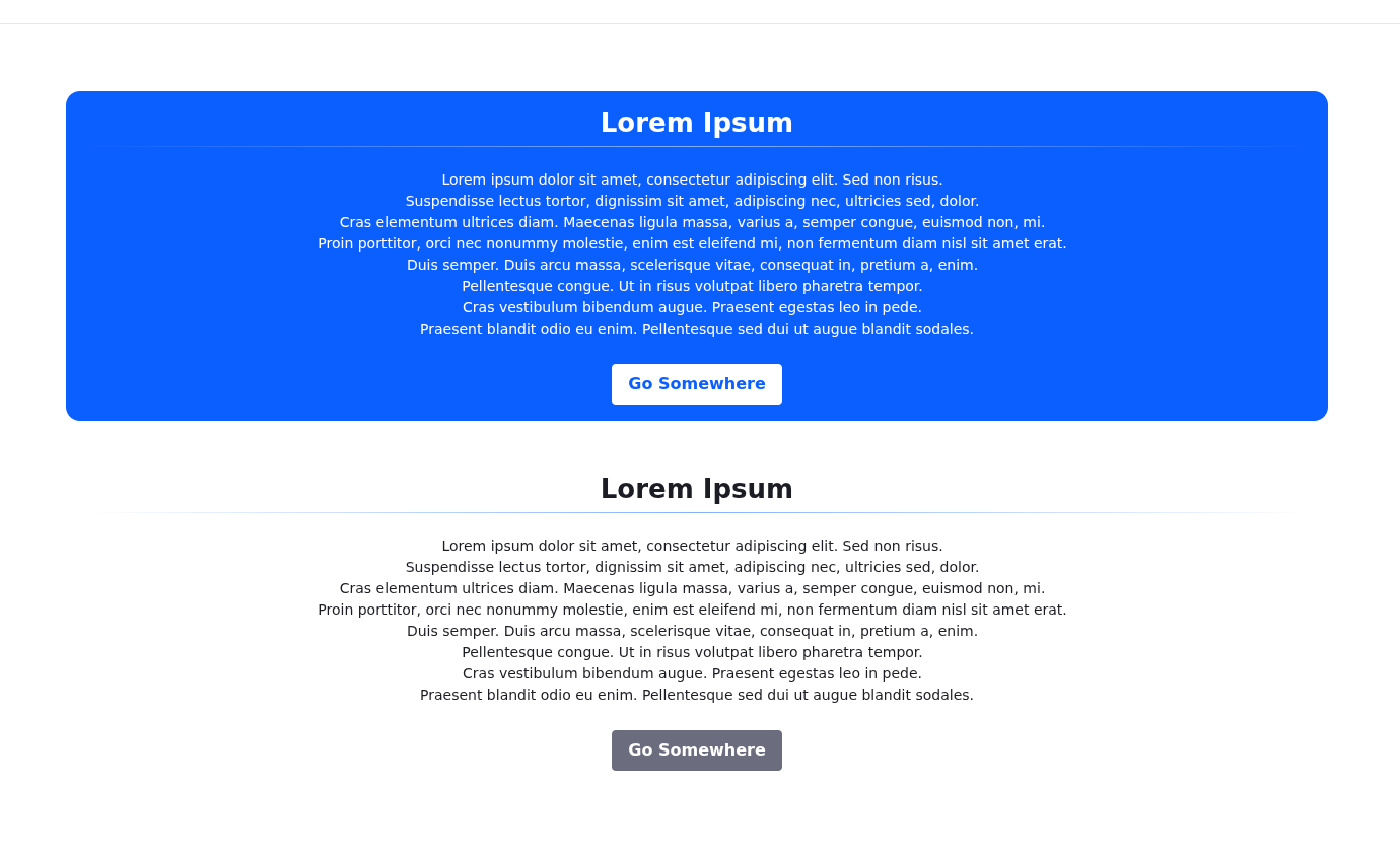
The Content Card Collection is a set of fragments designed to present textual content with flexible styling options. It includes Primary and Secondary Card containers, each with a drop zone that appli