
Responsive Bootstrap 1-3 Layout
Beschreibung
Weitere in Experience Management

1-1-1 Columns Layout CE
Simple three row template with 100% of width. Usefull to use in conjuntion with page templates (Prototypes). This layout will appear in your Page Layouts once installed. Check or request for more temp

14 Additional Basic Layouts Pack
Get 14 additional basic layouts to complete your portal in no time! You get: 1-3-1 Basic columns 1-3-2 Basic columns 1-3 Basic columns 1-4-1 Basic columns 2-3-1 Basic columns 3-1 Basic columns 4-1 Bas

2 Columns (10-90) Page Layout
Layout Templates allow you to choose how portlets will be arranged on a page. They are simple table or CSS-based containers into which portlets can be dropped and sit within the body of the page. Life
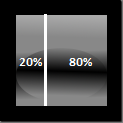
2 Columns (20-80) Page Layout
Layout Templates allow you to choose how portlets will be arranged on a page. They are simple table or CSS-based containers into which portlets can be dropped and sit within the body of the page. Life
Weitere von Kan Zhang

Responsive Bootstrap Theme
Responsive Bootstrap Theme is based on the Twitter bootstrap example - Hero: http://twitter.github.io/bootstrap/examples/hero.html It features a Responsive Bootstrap 1-3 Layout only available for the

Responsive Carousel Portlet
This Responsive Carousel portlet is designed to show the image Carousel/slideshow on an the responsive Liferay site. jQuery and flexslider are used as the basis for the Responsive Carousel portlet. Fe